Components
A component is a design you reuse: a button, a card, a navigation bar. Its copies, called instances, follow it. Change the component and every instance changes, except what an instance overrides.
- Create Component: select layers and press Cmd Alt K (Ctrl Alt K).
- Create an instance: drag the component from the Assets panel onto the canvas, or use Insert instance there.
- Go to main component jumps from an instance to its component.
- Detach instance (Cmd Alt B, Ctrl Alt B) turns an instance back into plain layers.
The Assets panel lists the document’s components, in a grid or a list, with a search.
Variants
Variants are versions of one component, such as a button that is primary or secondary, small or large. Select several components and use Create Component Set (Shift Cmd K, Ctrl Shift K), then add variant properties and their values. Each variant needs its own combination of values. On an instance, you switch variants from the Design panel.
Component properties
Besides variants, a component can expose:
- Text properties, to change a label on each instance;
- Boolean properties, to show or hide a part;
- Instance swap properties, to replace a nested component, such as an icon;
- slots, areas where each instance takes its own layers, with limits on how many.
Create one with Create property… in the Design panel, or from a field with Apply component property. Instances show these properties at the top of the Design panel.
Behaviors
A component can act like a real control: a switch, a checkbox, a slider, tabs, a text field, an accordion, a button with hover, pressed, focus and disabled states, and more. Choose it in the component’s Behaviour section. View › Preview (Cmd Alt Enter) then runs the controls for real: you can type in a text field, drag a slider, open an accordion, with the keyboard too. Nothing in the document changes while you try them; Esc returns to editing.
Libraries
To share components between documents, publish a document as a library with Publish library, then enable it in another document with Manage libraries. When the library changes, Review library updates shows what changed, side by side or as an overlay, before you update.
Variables
Variables are named values you reuse: a brand color, a spacing, a font size, a label. Change the variable and every layer that uses it follows.
Open the Variables page
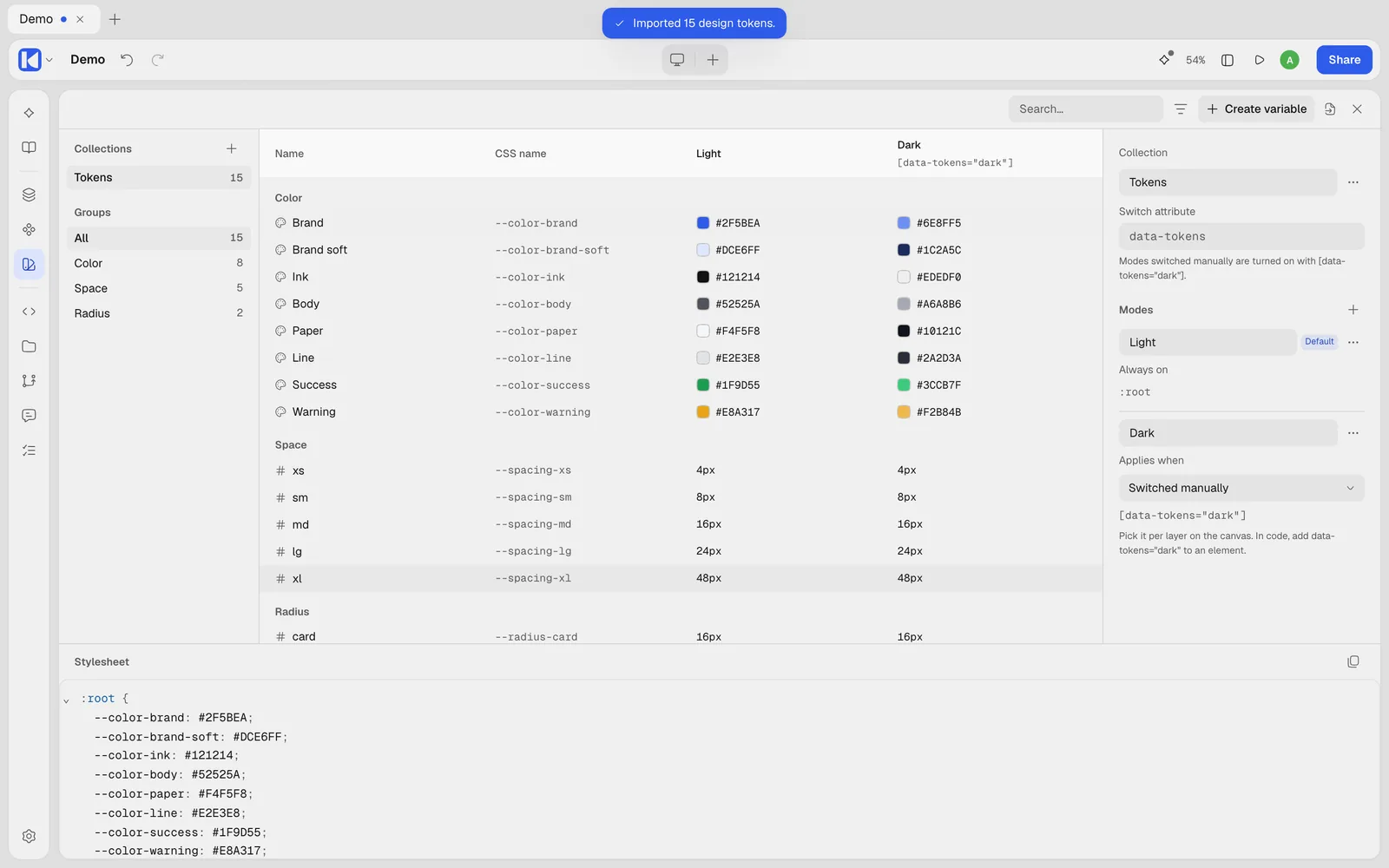
Click Variables in the left rail. In the desktop editor the Variables page opens over the panels and the canvas. Press Variables again, choose another panel, or press Esc to get the canvas back as it was. You can also open it with View › Variables…, or with Open variables in the Design panel when nothing is selected. On a phone screen it opens as a dialog.
Types
| Type | For |
|---|---|
| Color | fills, strokes, shadow colors |
| Number | sizes, spacing, radii, opacity, font sizes |
| Text | labels, copy, font families |
| Boolean | true or false, such as showing a layer |
A variable can be limited to some fields with its scopes, so a spacing never shows up in a color list. Its CSS expression lets it hold something like clamp(1rem, 4vw, 1.5rem) in the code.
Collections and modes
Variables live in collections, such as Colors or Spacing, and can be sorted into groups. A collection can have modes: light and dark, compact and comfortable, one per brand. Each variable has a value per mode.
Each mode says when it applies in the exported CSS:
- switched by hand, with an attribute such as
data-theme; - when the system is in dark or light mode;
- with high contrast or reduced motion;
- below or above a screen width, or a container width;
- or under any CSS selector or
@media,@supportsor@containerquery you write.
Use a variable
Next to a field, click Use a variable and pick one from the small list; hovering a color or number variable previews it on the canvas. Detach variable puts a plain value back. From a value you already set, Create color variable or Create number variable makes it a variable in one step.
Variables in the code
Variables are CSS custom properties. Every collection’s default mode is written in :root, and other modes only override the values that differ, under their condition. A variable named Gray/50 becomes --color-gray-50, and Space/small becomes --spacing-small; you can set your own CSS name.
From the Variables page you can:
- Copy all variables as CSS, or as a Tailwind theme (
@theme); - Export as design tokens: a
.zipof W3C design tokens, one file per collection mode; - Import design tokens from
.json,.tokensor.zipfiles. Variables with the same name are updated; nothing is deleted.
In a Kalka folder, variables are saved as W3C design tokens in design-system/tokens.json, and as CSS in design-system/tokens.css. See Files and versions.